
Round-UpA Study In Pink: Blush-Tone Dials That Are Breathtakingly Beautiful
Move over the traditional black, blue and white dials and make way for pink. Yes, you read that right… If there’s one trend that’s here to stay, it’s these beautiful timepieces flaunting pretty faces in the rosy hue. We look at some of the finest watches that feature dials crafted in various shades of pink, and are simply irresistible
May We Recommend
The watchmaking world is defined by two broad categories—design and mechanics. While it’s the technical aspect that really makes a watch tick (quite literally), it’s the design that becomes the face of the watch, giving it an instant recognisable appeal, often becoming a signature blueprint for the brand. While design encompasses many factors such as internal (movement assembly and decoration being the main aspects), it’s largely the external elements that come into play. Here one factors in the case material, shape, size, structure, lines and lugs, the bezel and the strap that it’s presented on. But it’s the watch face that ends up mostly stealing the show, and here’s where colour, symmetry, material, texture, gradient and the complications presented on the dial bring a designer’s vision to life. While the standard black, blue and white have been the go-to hues for many horology maisons, of late one had been seeing brands experiment with a lot of green, which had become the standard norm. A shade that used to be unique and not many brands had the gumption to use it in their timepieces has now become an accepted part of the watch colour wheel. But while a few shades find this acceptance, there are many colours, which still remain unique and require a highly nuanced approach in their execution while being incorporated in a timepiece. In my opinion, pink is one such shade, which falls into this category because a timepiece in this hue can evoke very strong reactions. One might just end up raving about it or completely dissing it. There’s certainly no middle ground here.
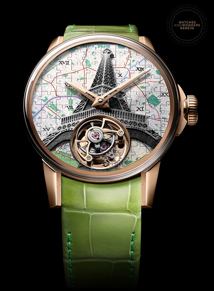
So earlier this year, when Breitling launched their split-seconds chronograph line—Premier Heritage—inspired by their legendary Duograph from the 1940s during the digital edition of Watches & Wonders, what really stood out were the refreshing colours—mint green and salmon pink—that clearly zhuzhed up the chronograph landscape. This is not to take away from the mechanism and the functions offered by the watch but the combination of a salmon-pink dial framed by a stainless steel case, presented on a glossy, dark brown leather strap is something that one doesn’t see regularly. This is also relevant because it highlights the fact that pink, which for the longest time has been viewed as a colour reserved for the fairer sex, has now seamlessly found its way to grace the dials of men’s watches as well. Even Oris’s Divers Sixty-Five Cotton Candy with a lipstick-pink dial and a bronze framework, launched earlier in the year, caught our eye for its understated aesthetics. However, this is not the first time that watchmakers are experimenting with pink and its myriad shades.

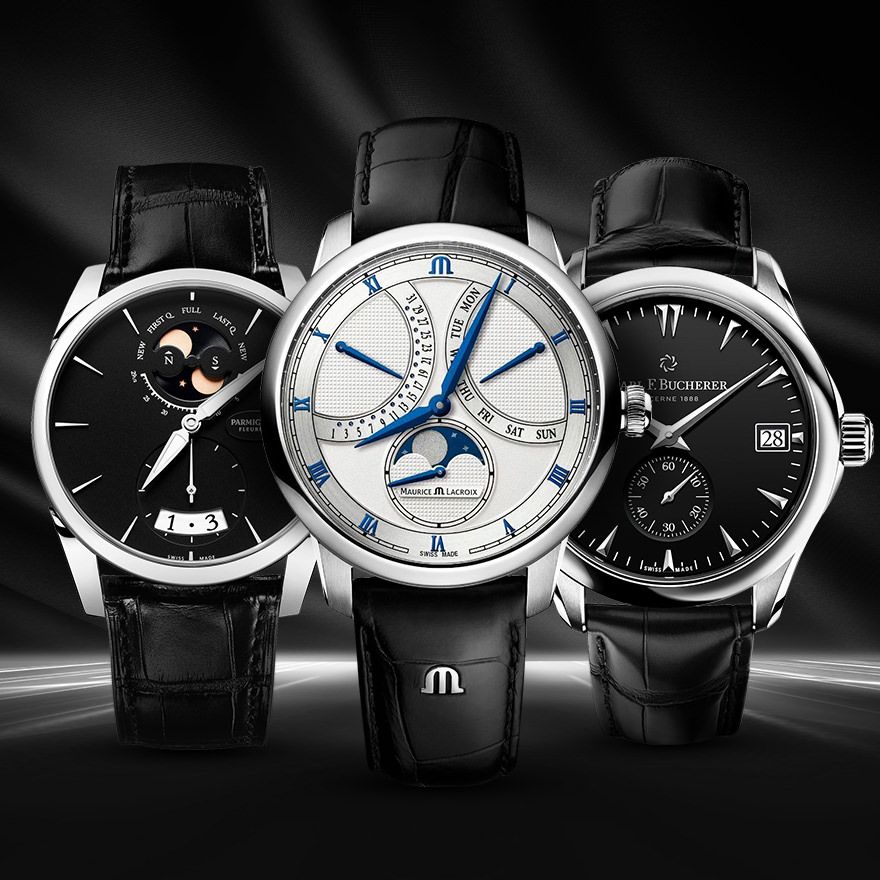
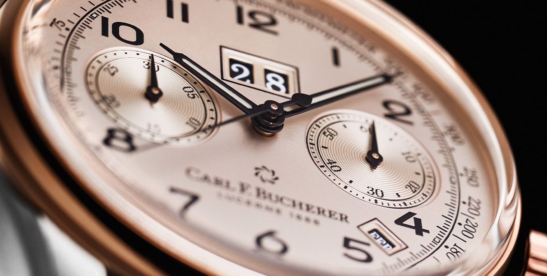
Many vintage Patek Philippe chronographs have salmon-coloured dials as well as the archives of Vacheron Constantin and even Audemars Piguet bear testimony to the fact that these high-value brands with a rich heritage have all used this colour for their dials at some point in watchmaking history. And since retro-revival is a huge trend, we see salmon-pink making a comeback and how. Even Carl F. Bucherer’s elegant Heritage BiCopmax Annual launched in 2019, pays homage to one of their chronographs from the 1950s, which showcased the symmetrical BiCompax design with two sub-dials, executed in an elegant, salmon-pink aesthetic. Let’s look at some timepieces that have put the colour pink and its various shades to brilliant use, and have combined them with apt materials and decoration for outstanding results.
The Conventional Deal: Pink
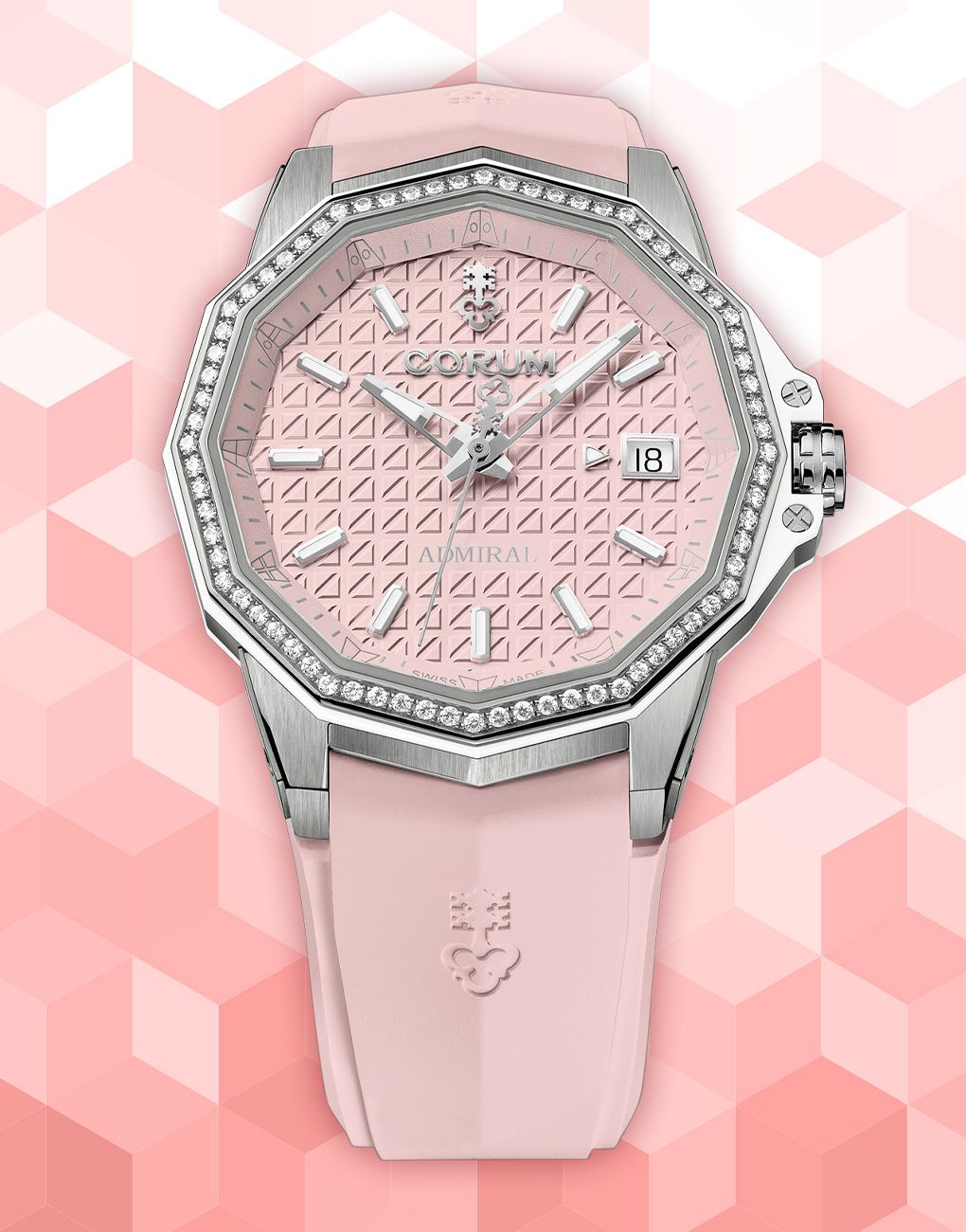
Think of the song ‘Pink’ by Aersosmith and you would know instantly what we are talking about. The true shade of pink would be best defined as a mixture that one gets by combing red and white colours. Neither too bright, nor too dull, this is probably a shade that you would find as a backdrop for almost all the scenes of Wes Anderson’s 2014 cinematic masterpiece, The Grand Budapest Hotel. Corum have incorporated this rosy-pink hue into their Admiral 38 collection with an automatic timepiece launched online during Watches & Wonders 2021. For a brand that’s synonymous with watches meant for the conquering the high seas, this comes as a breath of fresh air because mostly such watches are crafted in a colour palette that oscillates around the colours blue, black, white or grey. This Admiral 38 model looks contemporary without letting go of their signature 12-sided case and bezel. The watch has been given a more rounded shape, combining both polished and satin-brushed finishes on the titanium case. The dial looks stately and has been crafted out of brass—which generally forms the base plate and helps with imparting the perfect pink hue. It is decorated with Corum’s grenadier fendu (split pomegranate) geometric motif that is slightly reminiscent of the ‘waffle’ dial or the tapisserie pattern found in the iconic Audemar Piguet Royal Oak watches, but of course the difference is apparent. The pink tone of the dial enhances this pattern that features raised, diagonally-cut squares that add a deeper dimension to the watch face. A pink rubber strap complements the dial colour, and completes the look.
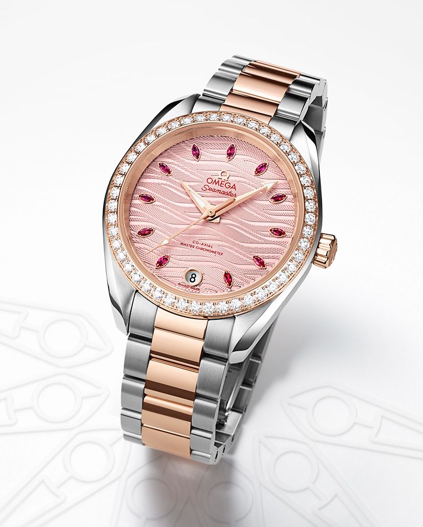
Similarly, Omega’s Seamaster Aqua Terra 150M Co-Axial Master Chronometer 34mm watch features a highly ornate facade and the brand have chosen a pink dial to be the face of this ultra-feminine timepiece. It comes in a symmetrical, stainless steel case topped by an 18-karat Sedna gold bezel, set with diamonds. The pale pink wave-embossed dial has central hour, minute and seconds hands in diamond-polished 18-karat Sedna gold, a date window at six o’clock, and 11 marquise-cut ruby hour markers. The dial pairs beautifully with the entire two-tone case and bracelet combination in this case.


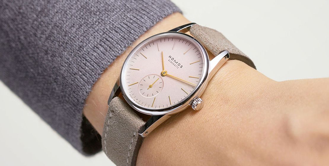
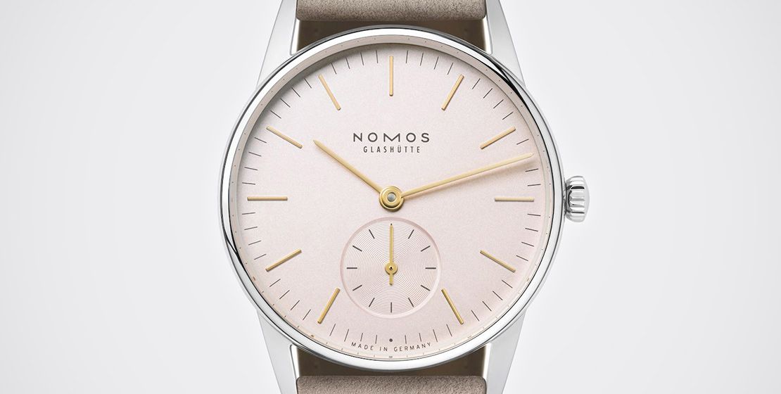
The English Rose: Blush Pink
This is a slightly more faded or a softer version of the conventional pink, which is quite pleasing to the eye. It almost borders on the off-white spectrum with a hint of pink. This offering from Nomos Glashütte is ideal for anyone with a small wrist or a penchant for clutter-free dials. The Orion Rose measures 33mm, and the subtle blush hue of the dial makes it perfect for daytime wear, ideally paired with a casual ensemble. So, for those who want to experiment with this colour but may be slightly apprehensive, this watch is ideal since it will never look gaudy, if that’s the fear. It is powered by a handcrafted manual-winding Alpha calibre, which needs to be wound every other day.


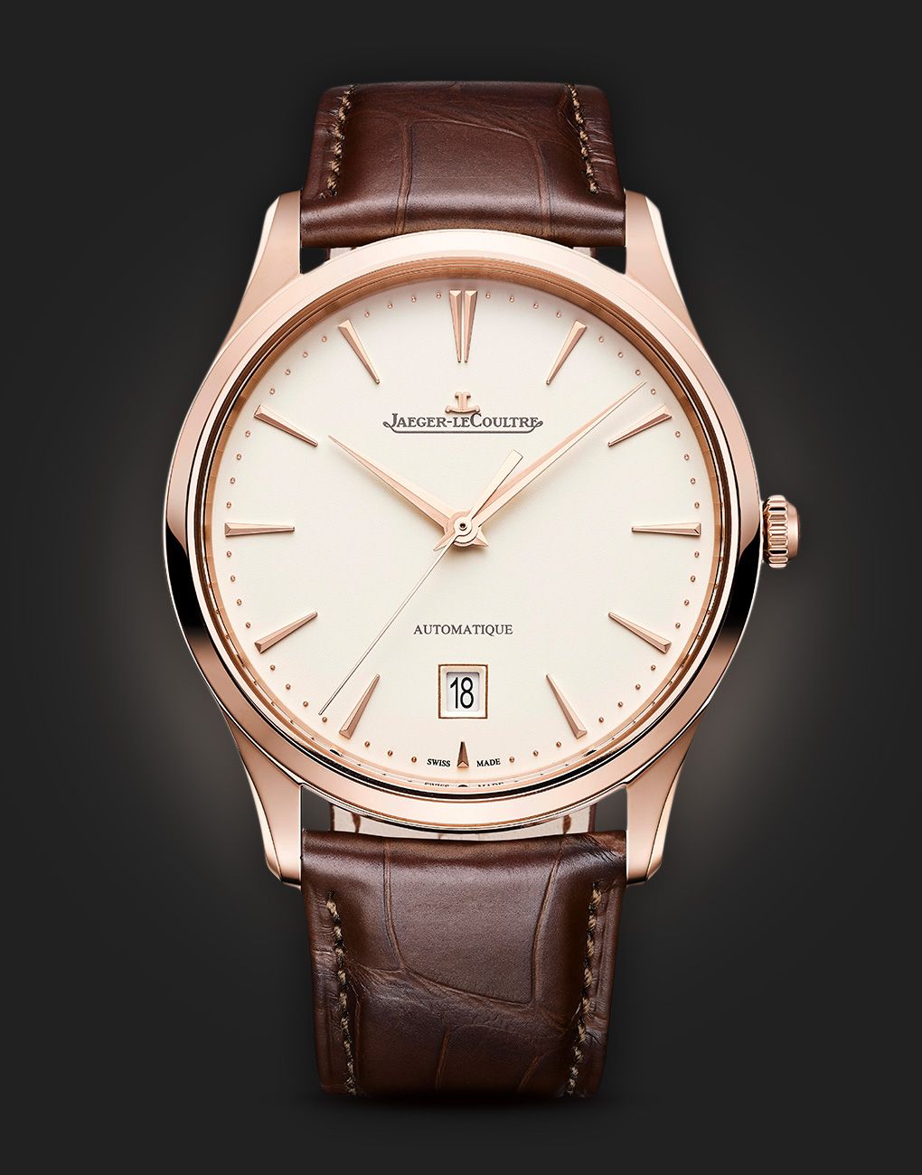
The elegant Jaeger-LeCoultre Master Ultra Thin Date with its sophisticated and sleek design epitomises minimalism in its classic form. Imbued with the perfect dress watch persona, this watch comes in a 39mm pink gold case that is matched with a faded pink dial, which may almost look beige from certain angles due to the sunburst finishing. It blends perfectly well with the case, lugs and the brown leather strap that it’s presented on. The dial also features the date in an aperture at six o’clock, in a revamped design, which maintains the symmetry of this finely-crafted timepiece.
Raising A Toast: Champagne Pink
Another shade that’s become an integral part of several watch brand’s design ethos is the effervescent champagne-pink hue. Now, this is a slightly tricky colour to work with as it can lean more towards a shade with more golden undertones, hence watch manufacturers have to strike the perfect balance where the pink undertones come to life, especially when light reflects off the dial’s surface. This shade of pink can look extremely refined, when executed in the right manner and looks brilliant when paired with a rose gold case. But some watchmakers like Maurice Lacroix have used this shade for their sporty Aikon Automatic watch, that’s crafted completely in stainless steel. And the dial of this 39mm timepiece looks splendid as it comes in a dull champagne-pink hue, enhanced by the sun-brushed Clous de Paris or ‘hobnail’ pattern. This size and colour scheme is also perfect for men and women.

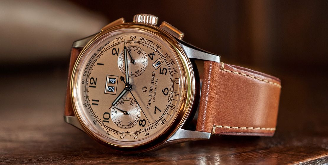
Another brand that have done justice to this shade is Carl F. Bucherer with their Heritage BiCompax Annual that combines elegance with contemporary sophistication. Inspired from their vintage chronograph from the 1950s, that also featured a pink dial, this elegant timekeeper is crafted in steel and 18-karat rose gold. This frames a gorgeous dial in a champagne-pink hue, which complements its understated design, despite being a mechanical complication with functions such as an annual calendar, date, and chronograph with a tachymeter scale. The dial also has a luminous material to give it the much-needed glow but this doesn’t look lurid at any point, even when its surface catches light at different angles.


Fishing For Compliments: Salmon Pink
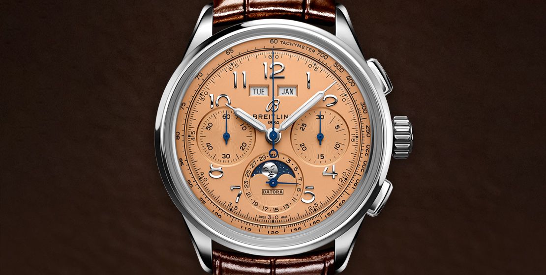
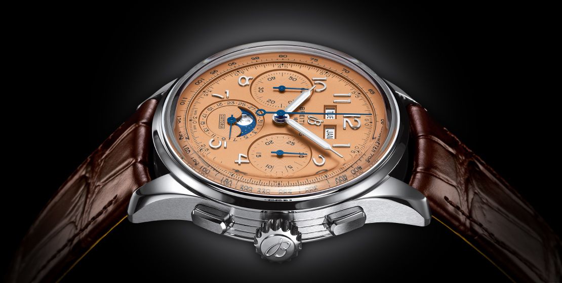
We have already spoken earlier about how salmon-pink is one of the hottest trends to grip the watchmaking universe, especially at a time when most brands are revisiting their heritage to build up on their present collections. Paying homage to three generations of inventors—Léon, Gaston and Willy Breitling—the latest generation of Premier chronographs brings the brand’s timeless elegance back to life, and showcases their highest level of watchmaking, thanks to a range of iconic Premier complications: the Chronograph, the Duograph and the Datora. Out of these the Datora looks extremely refined with its complete calendar and moon phase functions. The model featured here comes in a stainless steel case with a copper dial that imparts the salmon-pink hue to the watch face. This looks exquisite, especially when the moon phase indication and the hands in blue colour stand out against this backdrop.

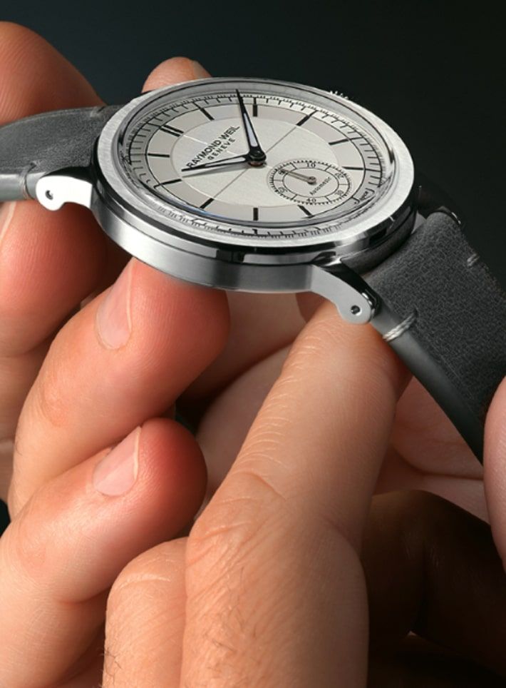
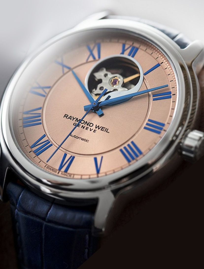
Raymond Weil have adopted a slightly more contemporary approach with their Maestro timepiece that comes in a 40mm stainless steel case, and features a striking dial in salmon-pink hue. The watch face captures the gaze with its aperture at the 12 o’clock position that reveals the balance wheel, while the remaining space is dedicated to the uncluttered design with Roman numerals and hands in blue. The case is polished and complements the dial with a sunray pattern, which enhances its pink hue as it sits on the wearer’s wrist, and catches light at different angles. This mechanical watch combines elegance and sophistication with innovation, and pays homage to Swiss haute horlogerie heritage.


Shop The Story
-

Corum Admiral
082.202.42/F378 PN12
-
Omega Seamaster
220.25.34.20.60.001
-
Nomos Glashutte Orion
325
-
Jaeger-LeCoultre Master Ultra Thin
Q1232510
-
Maurice Lacroix Aikon
AI6007-SS002-731-1
-
Carl F. Bucherer Heritage
00.10803.07.42.01
-
Breitling Premier
AB2510201K1P1
-
Raymond Weil Maestro
2227-STC-00808