ReviewPresenting H. Moser & Cie.’s Latest Endeavour Watch And A Perpetual Calendar For Dummies
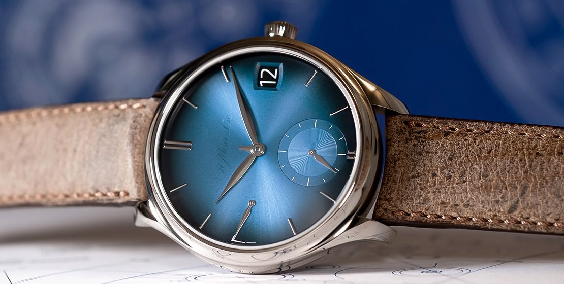
Following last year’s introduction of their ‘transparent’ logo, H. Moser & Cie. have unveiled an updated Endeavour Perpetual Calendar ‘Funky Blue’. Launched simultaneously is a companion piece that features what is essentially a user manual, right there on the dial itself—a far cry from the brand’s sophisticated and understated Concept dials and minimalistic appeal
May We Recommend
“We developed our Concept watches, with nothing on the dial. It was a big, bold move for a small brand. It was, I think, the strongest statement we’ve had and those dials became our signature simply by removing our signature. For the future, we will continue this way…” H. Moser’s CEO Edouard Meylan had stated in an interview with The Watch Guide back in 2019. Two years later, in 2021, the brand introduced their ‘transparent’ logo, introduced through a campaign they called ‘Erase the brand’, which was all about having the product itself become the ultimate identity for the brand, instead of the brand name. Made from transparent lacquer, this logo was in the same position where the more pronounced emblem used to make an appearance—just below 12 o’clock—and could be seen clearly only from certain angles of light falling on it.

The idea was that this would become the signature of the brand going forward, achieving a sense of balance, falling somewhere in between having a prominent emblem and a complete Concept dial. “This is what we’ll be using across all our watches,” Meylan informed us last year. “We could have more pronounced logos in special editions, while Concept dials will have no logo at all, which is what they’re about. But the regular editions of our watches will all have the transparent logo.” It started with the Pioneer Centre Seconds, and this month, the brand have extended this into the latest edition of their flagship watch—the Endeavour Perpetual Calendar, ‘funky blue’ edition.
Updated Dial; Same Outstanding Perpetual Calendar
Aside from the Concept-dial edition of the Endevour Perpetual, this edition is the cleanest yet, with understated elegance that presents sheer sophistication. The classical-adjacent watch was anyway the most pared-down perpetual calendar you could find. Stripped down to the essentials, this timepiece features only the date at three o’clock and a central stunted month hand—in terms of the calendar indicators on the dial—with the leap year display seen through the caseback view. This simple, but extremely impressive interpretation won H. Moser & Cie. the complication prize at the 2006 GPHGs (Grand Prix d’Horlogerie de Genève).
Since then, they have offered this award-winning complication in various special editions and mainline collections, including the Heritage line, and their newest one—the Streamliner, which also featured the transparent logo. So it was only a matter of time before they would bring the lacquered branding onto their flagship Endeavour watch. And it’s no surprise really that they’ve chosen to introduce it into this series with the ‘funky blue’ edition. After all, it is one of their most popular colours, and was among the first fumé (or ‘smoked’) gradient dials, which have also become a brand signature.
The Brilliant Calibre
Behind the brilliant blue of the dial is the in-house manual-winding calibre HMC 800, which runs at 18,000vph and offers a massive power reserve of seven days—indicated on the dial at nine o’clock. The highlight of this calibre is the ‘flash calendar’ system, which ensures an instantaneous date change, even going from the 28th to the 1st, between February and March. “Even around midnight, the date can be adjusted because of this system, since the mechanism has already snapped into place. And adjusting it around that time won’t even damage the movement, as would be the case with other perpetual calendars,” adds Meylan. The two discs for the date—showing the 1st to the 15th, and the 16th to the 31st, respectively—make this possible. The calibre also lives up to Moser’s standards of movement decoration, with fine-brushed detailing, their double Geneva stripes, and so forth. All this comes housed in a 42mm white gold case—affixed to a beige kudu leather strap, which was also used with the previous Endeavour ‘funky blue’ perpetual.
The Not-So-Brilliant ‘Tutorial’
Along with the minimalistic new Endeavour Perpetual, H. Moser unveiled a companion piece that is effectively an antithesis of the aforementioned minimalism, and even of Moser’s pared-down, understated appeal itself. On the one hand, the brand acknowledge that their Endeavour perpetual was already ‘considered by many to be the easiest…to read’, and on the other hand, they go on to spell out the meaning of all the indicators on the dial itself… Talk about excessive! Called the ‘Tutorial’, the 20-piece limited edition is essentially the user manual on the dial; or at least a page out of it. You’ll notice that the footnotes of the functions are far from concise. The power reserve display, for instance, comes with text that says, ‘7 days power reserve via double barrel’. Then there’s something about the jumping mechanism of the flash calendar system, about the date adjustability, and you’ll also see as many as three elements that scream up from the dial about how the month hand is supposed to work. To top that, there’s even a jarring yellow ‘tape’ that nudges potential users, with anything but subtly, to watch out for February 29. This is as ‘extra’ as it could get for an occurrence that comes once in four years. The most ironic part though is the text closest to the 12 o’clock position which says ‘clean dial’.
And ironic it is. It may be baffling to see so much on a Moser dial, but you can rest assured that this is just another side of the brand’s sense of humour. Even they call it a ‘perpetual calendar for dummies’ and state that it is completely ‘opposite to the minimalist philosophy habitually cultivated by H. Moser & Cie.’. Surely if this wasn’t a joke, and the intention was merely to make reading the functions easier, they would have stuck with simple markers of hours, minutes, months, high and low (or days) of power reserve, the date, and so on. Still there might be takers of the over-the-top Tutorial edition, if one has enough of a sense of humour to wear the joke, like a T-shirt with a funny comment or cartoon. That’s probably why the brand decided to make 20 pieces of this watch, you know, just in case.
A Transparent Refresh
Thankfully, the regular edition is not limited, and is simply the latest Endeavour Perpetual Calendar ‘Funky Blue’, with all the goodness of the one that came before. Let’s face it though. The new transparent logo definitely makes it look slicker, and fresher than its predecessors. And unlike the gimmick side-piece, it certainly celebrates the minimalism of H. Moser & Cie.


