
ReviewGoing Places: Carl F. Bucherer, With The Heritage BiCompax Annual Hometown Edition
The Heritage BiCompax Annual by Carl F. Bucherer has presented the not-oft-seen combination of a chronograph with an annual calendar. It’s been a success story for the brand, with several variations unveiled since it was first launched in 2018. This year, they’ve presented the new Hometown versions, with depictions of 16 different towns on the casebacks of these limited editions, including Mumbai. Have a look
May We Recommend
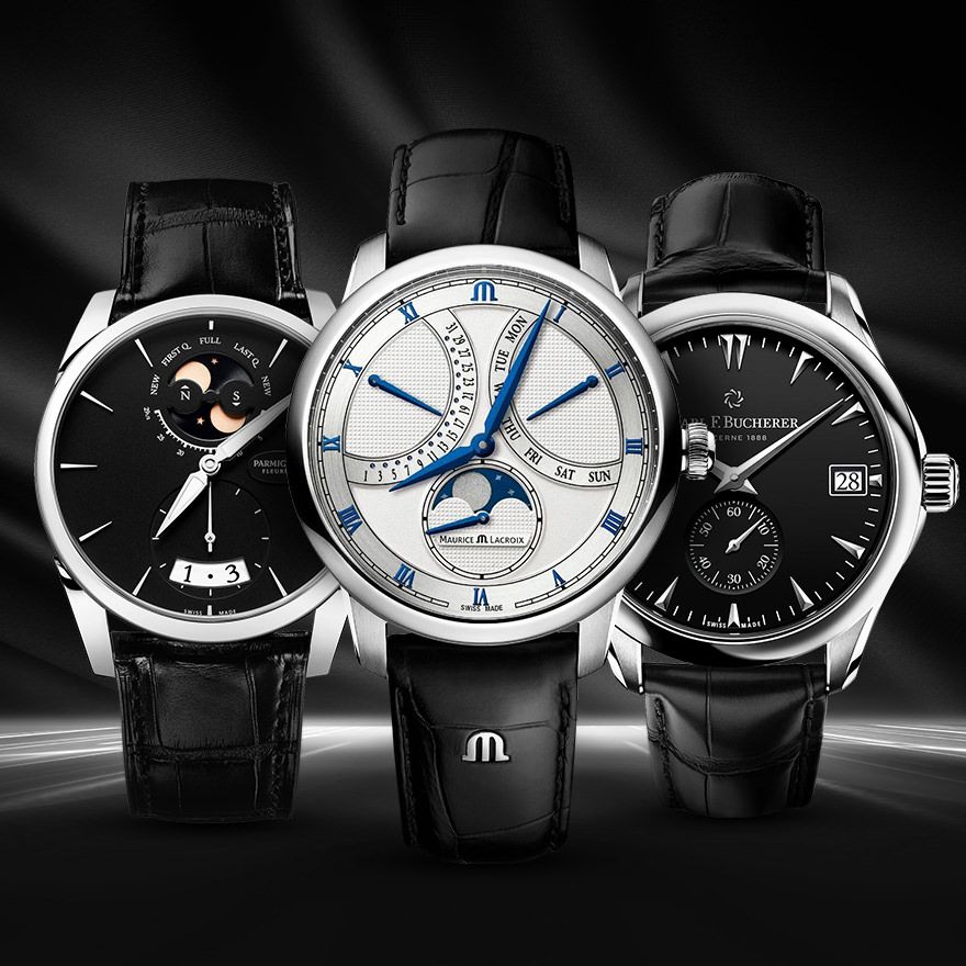
If there’s one brand who know how to build on success and keep the conversation about their flagship timepieces going, it would have to be Carl F. Bucherer. With new variations of past successes, they diversify their portfolio, and keep their collections fresh. Especially with the templates they create that speak to a wide audience, it’s no surprise that they’d simply keep introducing newer colours and materials with the same designs and movements. We’ve seen it with their Manero Flyback, which is the gift that still keeps on giving. And now, we’re seeing the Heritage BiCompax Annual on a similar path. In fact, when it was first launched, seeing as it was a bi-compax chronograph, one thought that this would be their ‘new Manero Flyback’. However, their Flyback—which was no doubt an achievement in itself—is still somewhat more accessible, as the watches are not limited editions. The Heritage BiCompax Annual, on the other hand, only comes in limited editions—like all watches from the Heritage collection—and it also includes an annual calendar.
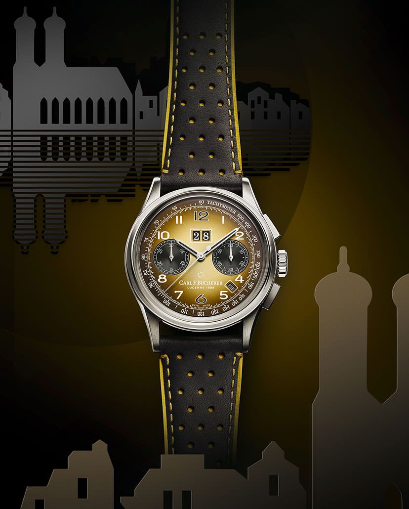
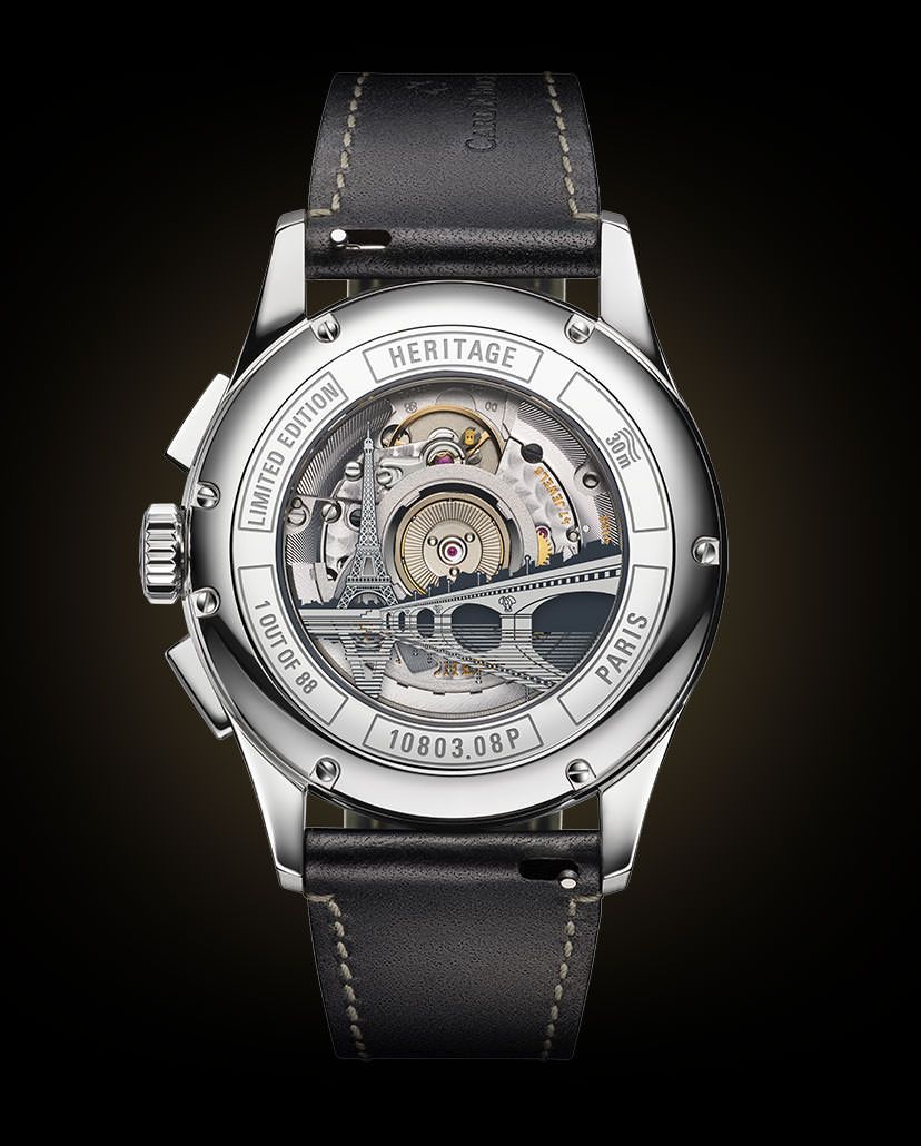
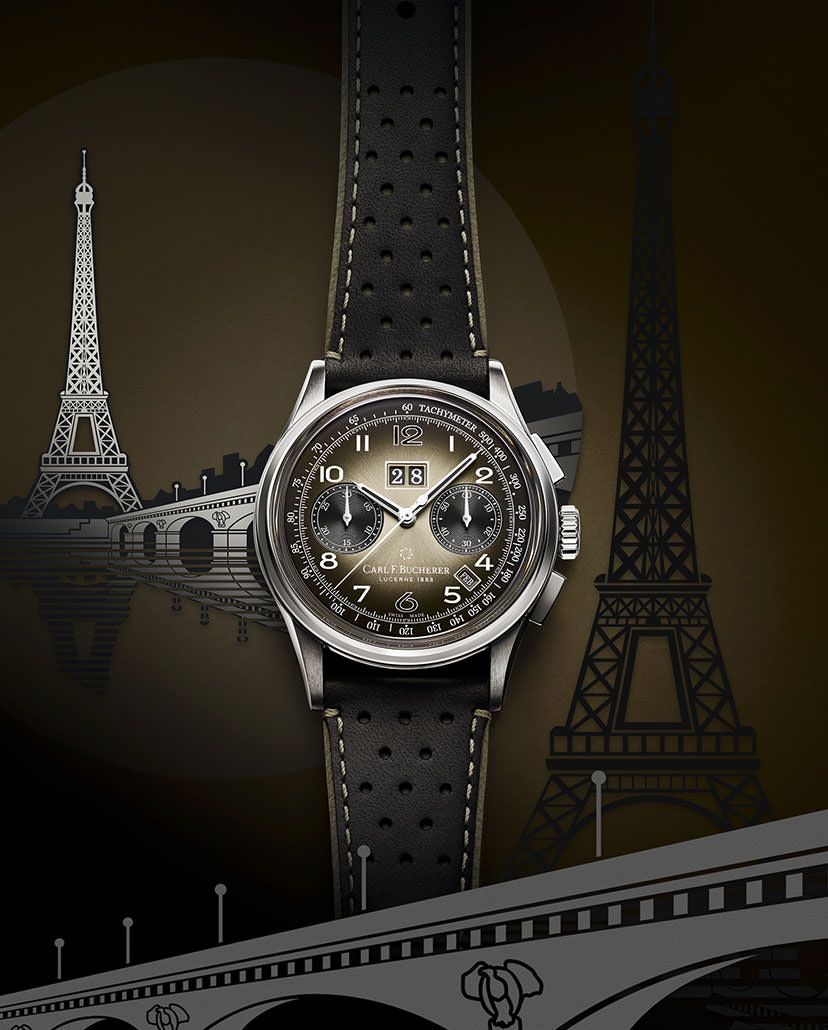
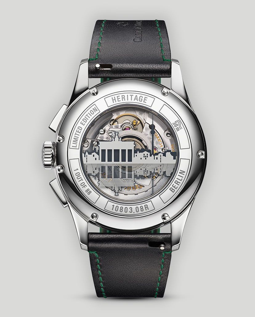
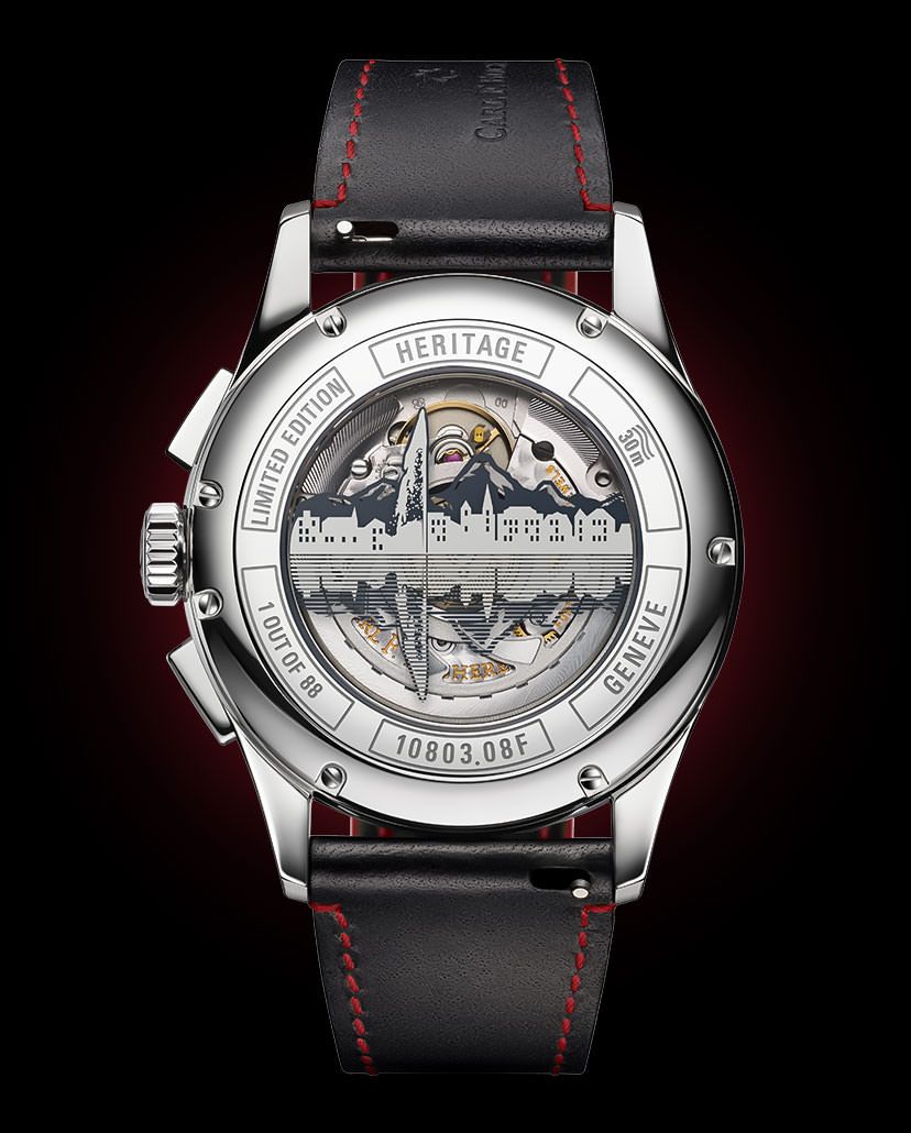
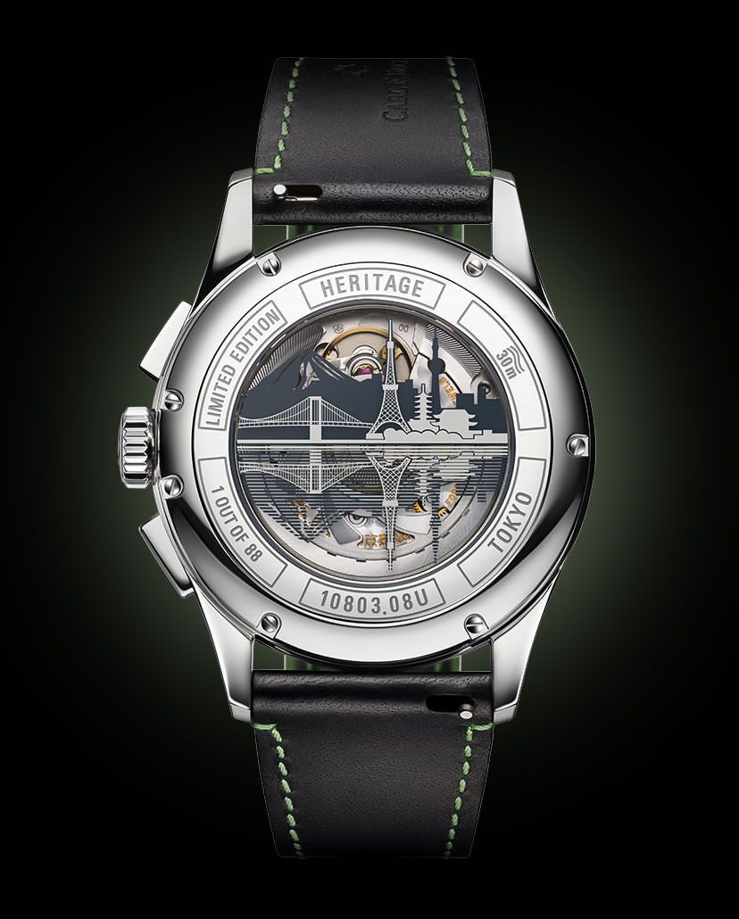
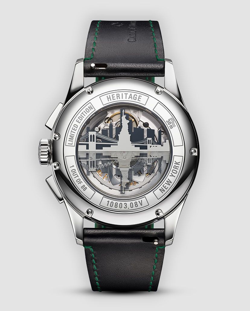
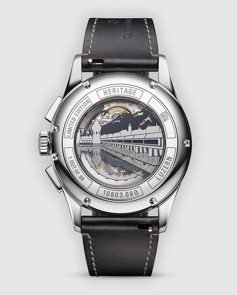
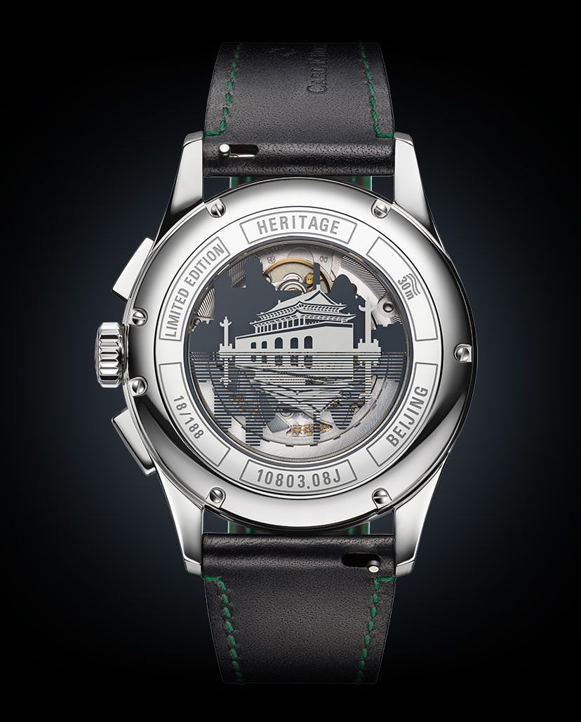
The watch was first launched in steel and gold with a champagne-coloured dial, as well as in steel with a black-on-white dial. Subsequently, they came out with another version of the latter with a white-on-black dial, then a Lucerne edition in blue, a ‘Bucherer Blue’ version (their boutique-only edition), and a unique piece for the Only Watch auction for a cause. Now, following from their Lucerne piece, they’ve gone one step ahead (or 15), with a total of 16 cities represented, in a new Hometowns edition. Distributed across five dial versions, each of these 16 cities is represented by the depiction of its signature landmark or skyline, 3D-engraved on the sapphire crystal of the caseback.


Emblematic Hometown Representation
It’s not a new concept really, to have cities or countries depicted on watches. It’s been done in the past using flag motifs or colours, but most popularly, by depicting icons of the places they’re meant to represent. These are almost definitively landmarks. Sure, sometimes simply a skyline works, if it’s as distinctive and famous as New York City’s, owing to the Empire State and Chrysler Buildings, among others. That’s because there’s only so much detail that can be shown, and these depictions are, more often than not, simply silhouettes, or outline drawings, with only key features highlighted. Among brands that have recently done this are Omega and MeisterSinger. While the latter picked one major landmark each for most of their city/country editions for the centre of the caseback, the former chose all major icons of the cities and arranged them to surround the exhibition part of the caseback.
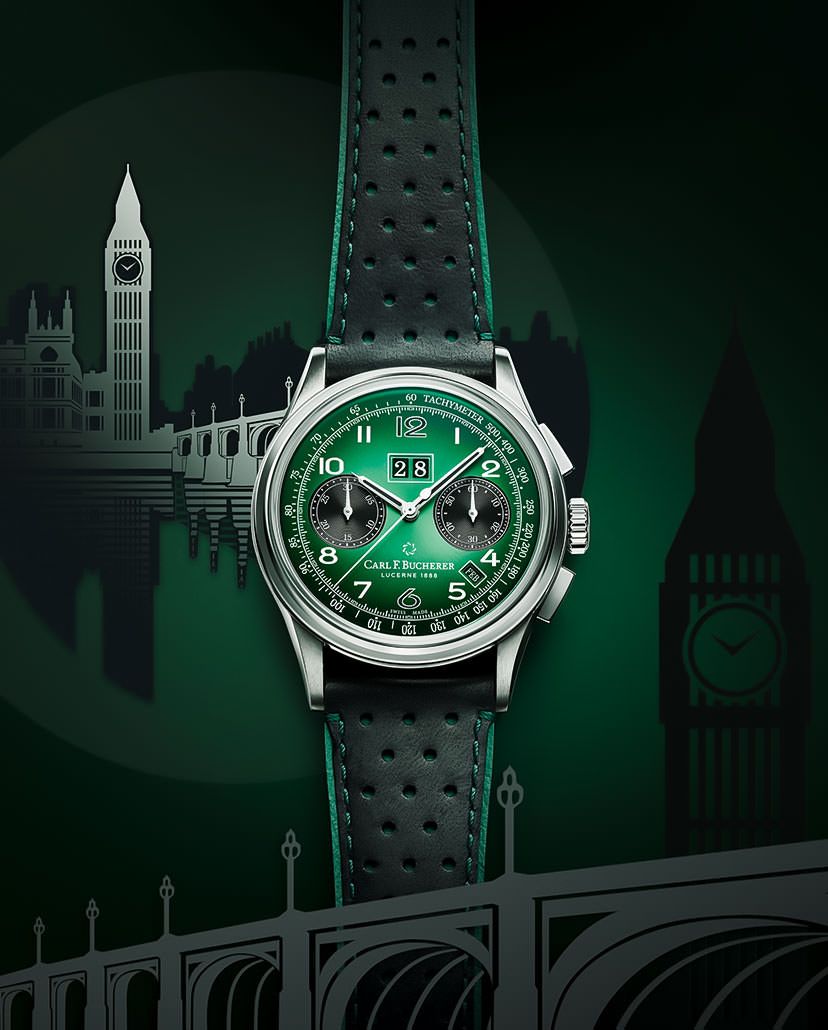
What Carl F. Bucherer have done is more on the lines of what MeisterSinger did. They have picked one major icon and perhaps secondary places in the background to show more of the city. For instance, if the Berlin edition puts the Brandenburg Gate at the forefront of the caseback, with outline details, there is also a silhouette of Berlin’s TV Tower in the background. If the New York watch focuses on the Statue of Liberty, the Brooklyn Bridge has also been featured alongside. It’s been done quite well in most of the editions, even if some seem more detailed and intricate than the others.
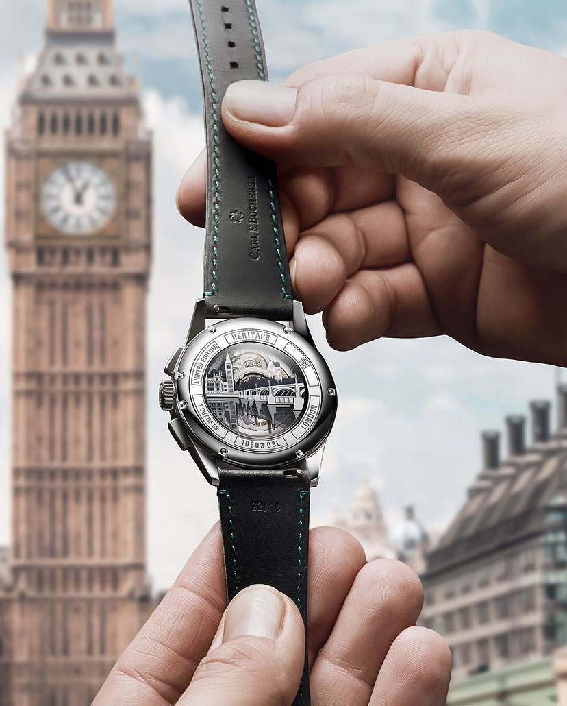
Mumbai: The Gateway To India
The good news for us is that the Mumbai edition features a very nice depiction of the Gateway of India, which is as detailed as one would want it to be, along with a silhouette of the famed Taj Mahal Hotel in the background—as one might see them when viewed from the Arabian Sea.
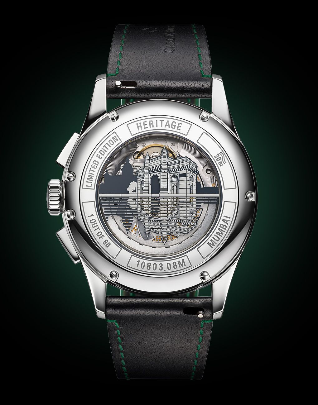
One feature that we see across all editions is a mirror image of each depiction, in the reverse, on the lower half of the caseback’s sapphire crystal, with a striped pattern. This element ties the entire series together. More importantly, the half-and-half treatment of the main motif and its reflection helps in keeping the designs proportionate and balanced. It’s all very pleasing to look at, and it’s very clear that these casebacks are definitely the heroes of these watches.
Painting The Towns Red, Green, Yellow And So On
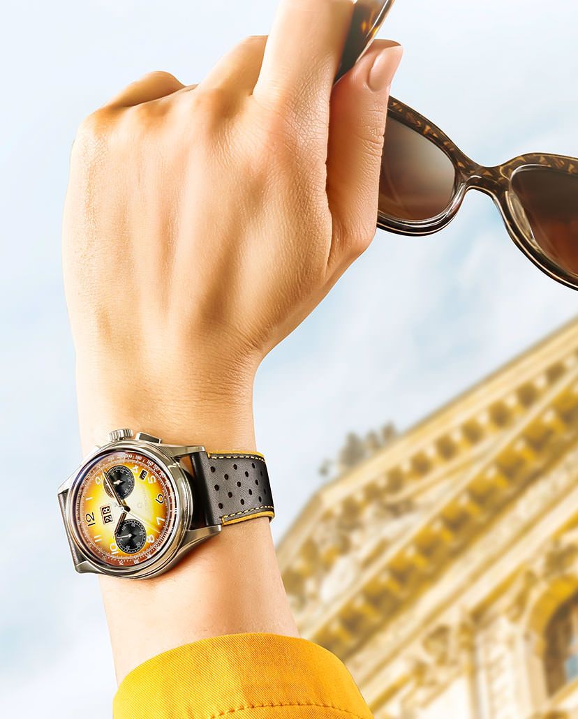
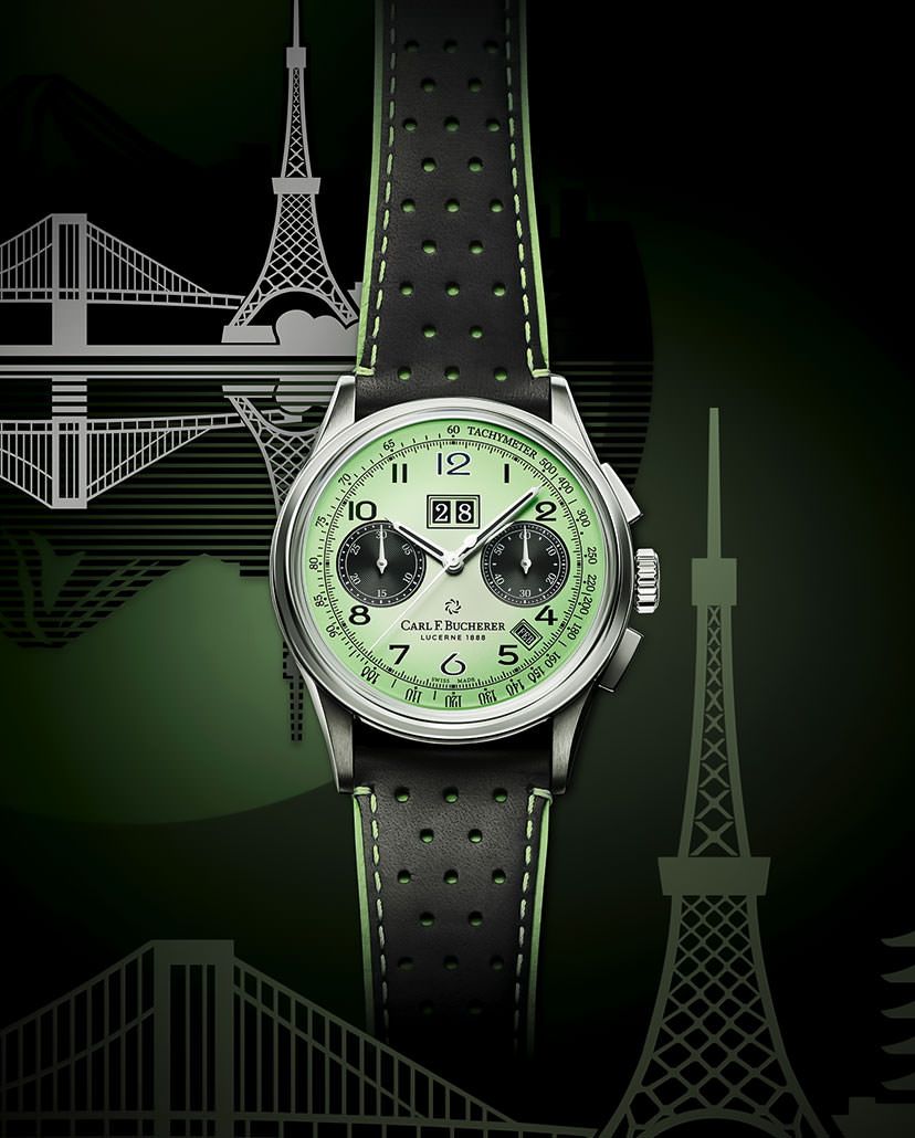
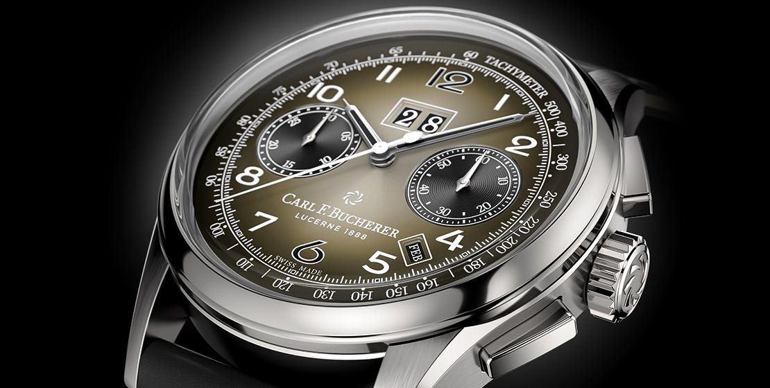
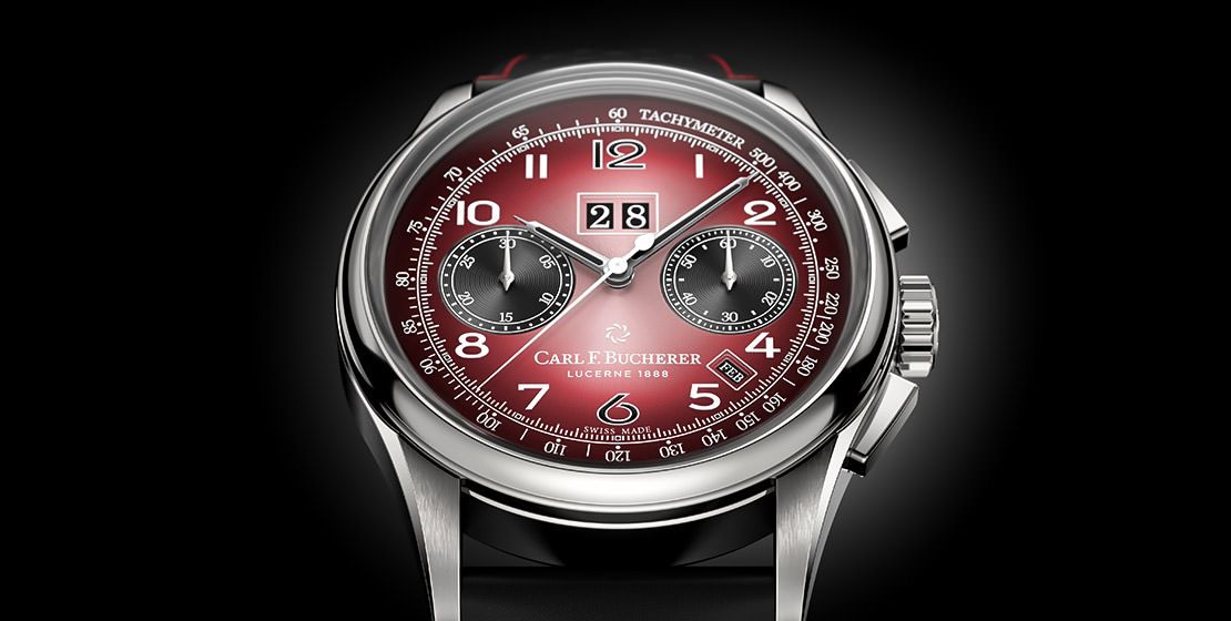
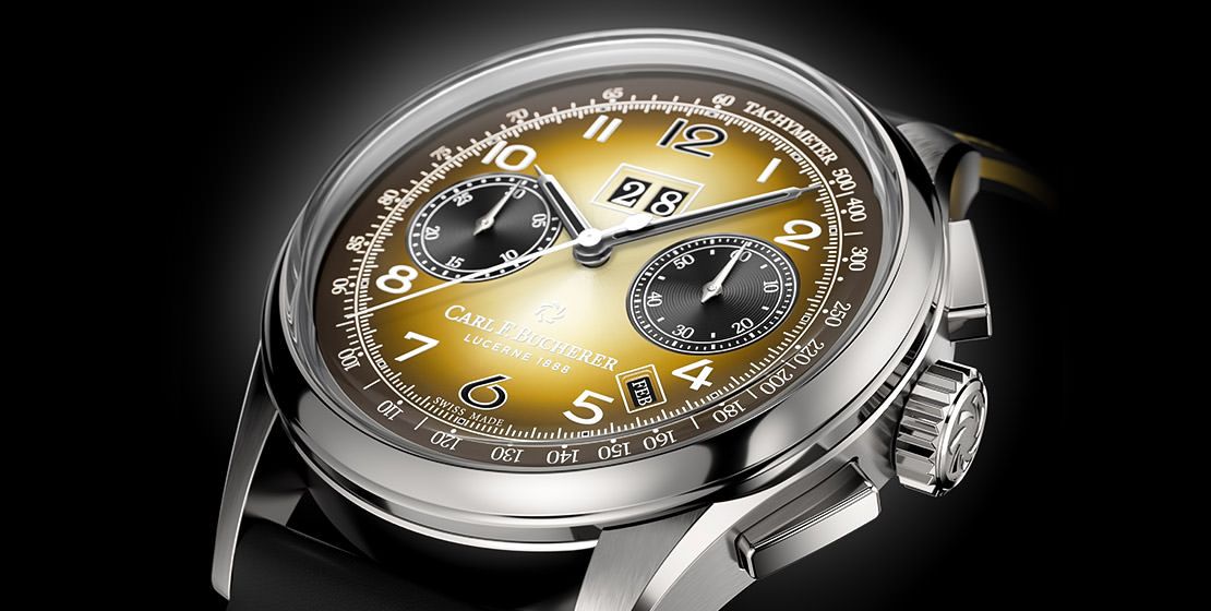
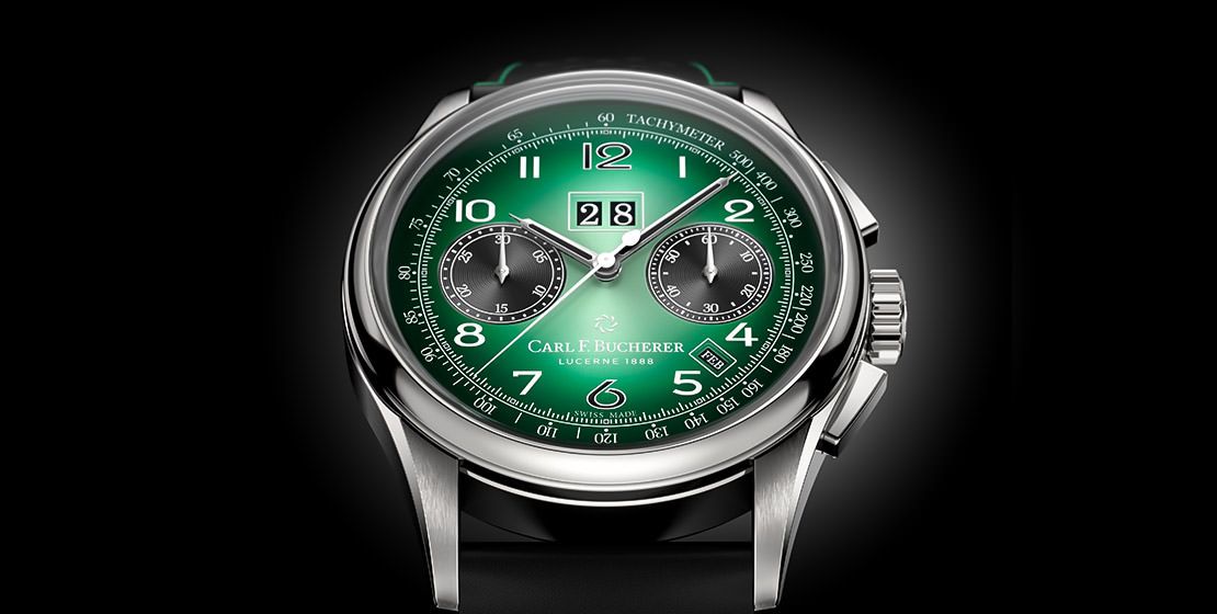
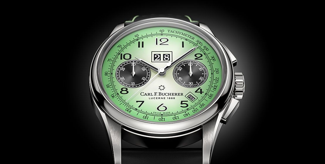
On the flip side, the dials don’t really have anything to do with the cities. Across 16 cities, there are five colours, which aren’t really linked to the towns on the casebacks. All dials are gradients, so they are silvery at the centre and gradate radially outwards to their colours. These are yellow, mint, burgundy, brown and green, which aren’t distributed equally across cities. There are literally just one yellow (Munich) and two mints (Vienna and Tokyo). Basel and Geneva come in burgundy; Paris, Lucerne, St Gallen and Zermatt come in brown; Mumbai, London, New York, Berlin, Zurich and Bern come with green; while Beijing comes with burgundy as well as green. This is evidently because there are 188 pieces of the Beijing edition, while the rest of them have 88 pieces each only. Clearly the demand is higher in Beijing than anywhere else. And that is also the basis of choosing the colours for each city.
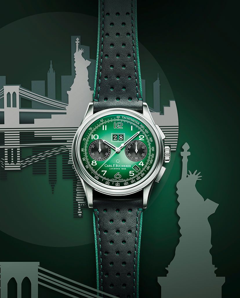
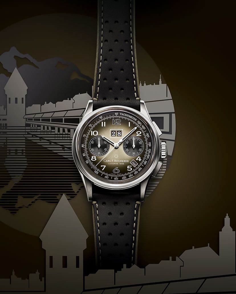
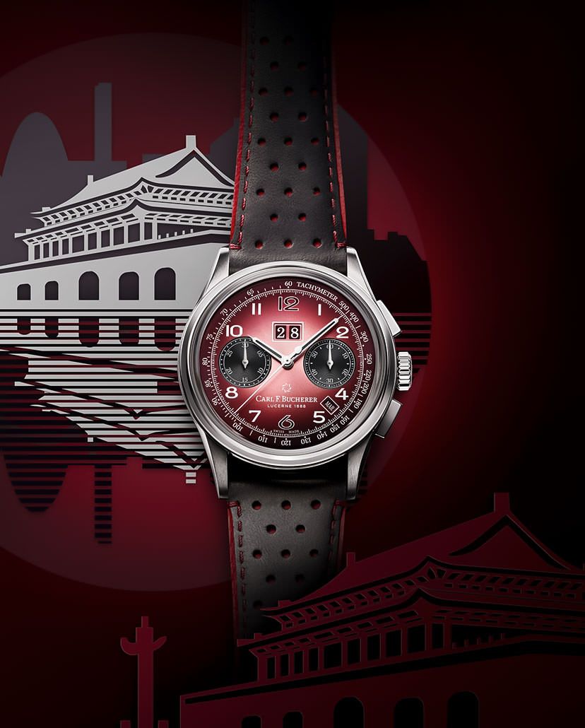
“We talked to the boutique teams in each town about the preferences of their own clients, which allowed us to choose colours that will resonate with the wants and needs of the customers in each city,” states Sacha Moeri, CEO, Carl F. Bucherer. Also seen in the form of accents on the perforated leather straps, the colours themselves are very specific—a hit and miss perhaps. While the brown dial is rather pleasant and easier on the eye, the burgundy is definitely more striking, and the yellow could be quite polarising. And while the green should be crowd-pleaser, the mint might require an acquired taste.
Home Is Where The Heart (Of The Watch) Is
Regardless of the colours, the dial features remain the same, down to the markings, the snailed texture of the black sub-dials, as well as all indications—the time, chronograph, big date, month, along with a tachymeter scale. Powering all these functions is the automatic calibre CFB 1972, which offers a standard power reserve of 42 hours. It’s the same movement that the Heritage BiCompax line was launched with, offering the very useful annual calendar function, which means that it needs adjusting only once a year—on March 1. Combined with a chronograph, it’s not a very common offering, and hence a feather in the brand’s cap. It’s their pride and joy, just like their own hometown, the city of Lucerne in Switzerland, which was kind of like the starting point of this Hometown edition to begin with.

The brand state that their roots may be in Lucerne, which is still very much their hometown. However, as they’ve explored new regions, and given their ‘free-spirited’ nature, they feel quite at home in several places around the world. Effectively considering these cities as homes away from home, they believe that their strong ties to these places makes them their hometowns in a different sense. Of course they’re tied to their homeland Switzerland more than any other country, so they have seven Swiss cities, five other European urban centres, three commercial hubs of Asia, and finally, New York City as well. This helps the brand indirectly reiterate their strong presence in these regions, while also giving these towns dedicated editions of their flagship limited edition. And that definitely sounds like a good way to keep conversations going about their flagship series, while also speaking directly to specific audiences. Now that indeed sounds like building on success.
Shop The Story
-

Carl F. Bucherer Heritage
00.10803.08.92.89


very nice watch